Zimt Moral
Year
2026
Client
Academic Project
Service
Accessible Type Design
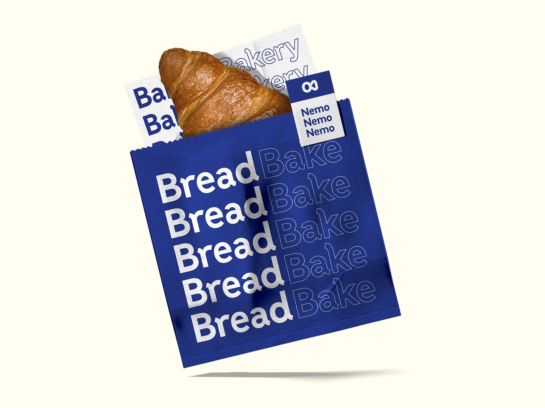
A custom typeface project refining modern sans-serif aesthetics to maximize structural consistency and digital accessibility.
© Zimt Moral
Challenge
While modern sans-serif typefaces like Reddit Sans successfully blend a clean, contemporary character with playful details, they often lack design consistency across the entire alphabet. This fragmentation compromises visual harmony and, more importantly, limits digital accessibility and legibility for users, especially in text-heavy environments.
Solution
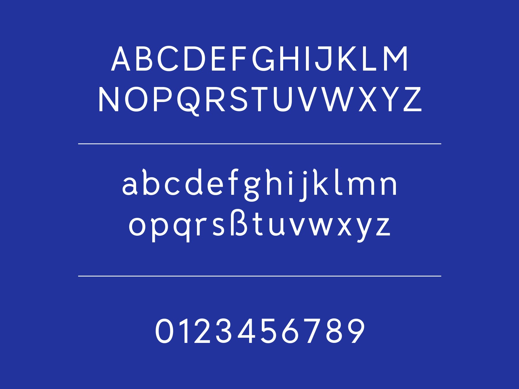
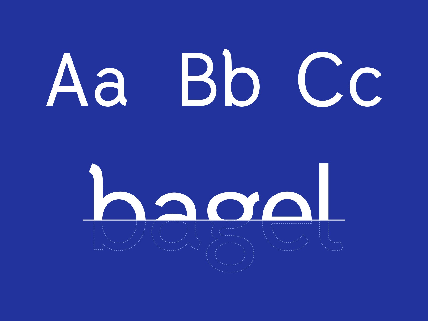
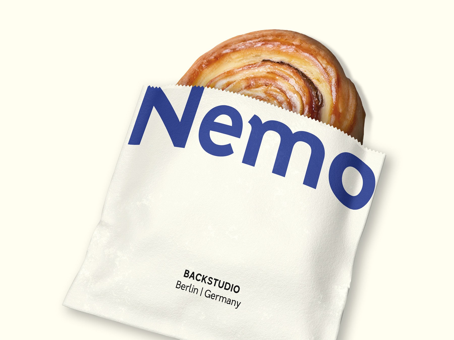
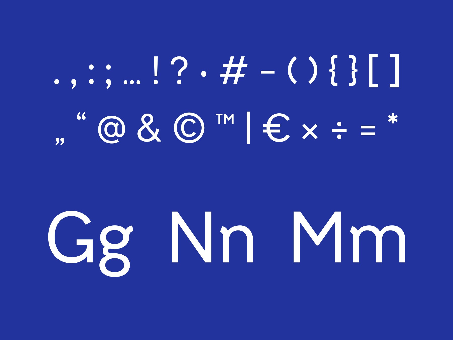
Developed in Glyphs, Zimt Moral is a custom typeface that bridges the gap between geometric clarity and organic warmth. Built upon the foundation of Reddit Sans, it systematizes its distinctive "feet" into a fully consistent typographic rulebook. The result is a refined, highly accessible typeface that retains its casual, human touch while optimizing readability and structural balance.
Easy Funeral
COIN